
 открыть бот


How to build a tab component in React
Tabs are user interface components that render and display subsections to users; they arrange content into categories for easy access and make your apps look cleaner by saving space. Tabs are a prevalent UI component, and it is essential to understand how to implement them as a developer.

This article will show you how to build a tab component in React and create functions that will handle tab switching.
We will cover:
Prerequisites
To follow along with this tutorial, you’ll need to have Node.js installed on your machine. You should also have a working knowledge of:
- CSS
- JavaScript
- React
- React Hooks
Starting the React project
Let’s set up a new sample project for this tutorial. To get started, we need to create a new project using Create React App. Run the following command in your terminal:
npx create-react-app tab-component-sample
The above command will download all packages that are required to get your React app running, as well as scaffold a new React app with the default Create React App template.
Next, change your directory into the directory of the newly created app with the below command:
cd tab-component-sample
Use the following code to start up your local development server to view the CRA sample web app:
npm start
Now, open up a new tab, and render the sample template included in CRA. If it doesn’t open automatically, open up your browser and enter http://localhost:3000/.
Creating a tab component in React
Before we create a tab component in our React app, we need to remove the CRA boilerplate. In the source folder, find the App.css and Index.css files and clear the styling written there (we will create our own).
Open the App.js file, delete everything wrapped inside the div with the app class name, and delete the line that imports the SVG logo:
import logo from './logo.svg';
The App.js file should look like this after the cleanup:
import './App.css';
function App() {
  return (
    <div className="App">
    </div>
  );
}
export default App;
In your src folder, create a new folder called Components that will house the components we will create. Then create another subfolder called TabComponent, which will house the Tabs.js file:
src
    +-- Components
      +-- TabComponent
        +-- Tabs.js
Now, add the following code to the Tab.js file to show that we are exporting it:
import React from "react";
const Tabs = () => {
  return (
    <div className="Tabs">
      <p>Hello Tab works</p>
    </div>
  );
};
export default Tabs;
Next, we need to import the Tabs.js file into the App.js file:
import "./App.css";
import Tabs from "./Components/TabComponent/Tabs";
function App() {
  return (
    <div className="App">
      <Tabs />
    </div>
  );
}
export default App;
If it’s not displayed on your side, confirm that you are importing the component and exporting it correctly.
Add the following code to your Tabs.js file:
`import React from "react";
const Tabs = () => {
  return (
    <div className="Tabs">
      {/* Tab nav */}
      <ul className="nav">
        <li>Tab 1</li>
        <li>Tab 2</li>
      </ul>
      <div className="outlet">
        {/* content will be shown here */}
      </div>
    </div>
  );
};
export default Tabs;
In the code above, we have two sections wrapped in the parent tabs’ div: the nav, and outlet. nav handles the navigation between tabs while outlet will render the contents of the active tab.
It will look ugly when you view it in your browser, and it won’t make any sense, but we’ll add some CSS later.
The next step is to create components for each tab. In this guide, we will create two first, then extend the code to support many tabs. First, let’s write code to build two tab components.
In the Components folder, create a new folder and name it AllTabs. Then, create two files and name them FirstTab.js and SecondTab.js respectively:
src
    +-- Components
      +-- AllTabs
        +-- FirstTab.js
        +-- SecondTab.js
The firstTab.js file contains the code for what needs to be displayed on the first tab, and secondTab.js contains what it should display on the second tab:
// FirstTab.js

import React from "react";
const FirstTab = () => {
  return (
    <div className="FirstTab">
      <p>First Tab!! Hurray!!</p>
      {/* First tab content will go here */}
    </div>
  );
};
export default FirstTab;


// SecondTab.js

import React from "react";
const SecondTab = () => {
  return (
    <div className="SecondTab">
      <p>Second Tab!! Hurray!!</p>
      {/* Second  tab content will go here */}
    </div>
  );
};
export default SecondTab;
That’s all we need for now. Let’s move on to styling.
Styling the React tab components
We need to add some styling to what we have created so far. For the sake of this guide, we’ll be writing all styles in the App.css file. You’re free to create separate style files for each component, but don’t forget to import them.
First, let’s remove the default styles the browser adds to our elements, because we want to control the margin and padding ourselves. Using the asterisk selector in CSS, we can select every element on the web app and style them how we please.
We’ll reset all margins and padding to zero, and provide every element a box-sizing of border-box, including all padding and borders to the element’s width:
/* Remove browser defaults */
* {
 box-sizing: border-box;
 padding: 0;
 margin: 0;
}
...
Now let’s style our App.js wrapper. This is a demo app, so it will be a single page that takes the entire width and height of the screen. We also need all elements in the app to be centered in the middle:
// Style App.js wrapper
.App {
 width: 100vw;
 height: 100vh;
 display: flex;
 align-items: center;
 justify-content: center;
 overflow: hidden;
}
...
Next, let’s style our Tabs component. The styling is going to be simple; just add some margins and padding for spacing and a background color to make it look nice:
/* Tab Container */
.Tabs {
 width: 80%;
 height: auto;
 min-height: 400px;
 background: #053742;
 margin: 3.5rem auto 1.5rem;
 padding: 2rem 1rem;
 color: #E8F0F2;
 border-radius: 2rem;
 @media (max-width: 769px) {
  padding: 2rem 0;
 }
}
...
Moving on, we need to distinguish our nav buttons from the tab body so that users can quickly see the navigator and switch between tabs:
/* Tab Navigation */
ul.nav {
  width: 60%;
  margin: 0 auto 2rem;
  display: flex;
  align-items: center;
  justify-content: space-between;
  border: 1px solid #39A2DB;
  border-radius: 2rem;
  padding-left: 0px;
  @media (max-width: 768px) {
    width: 90%;
  }
}
ul.nav li {
  width: 50%;
  padding: 1rem;
  list-style: none;
  text-align: center;
  cursor: pointer;
  transition: all 0.7s;
  border-bottom-left-radius: 2rem;
  border-top-left-radius: 2rem;
}
ul.nav li:nth-child(2) {
  border-radius: 0;
  border-bottom-right-radius: 2rem;
  border-top-right-radius: 2rem;
}
ul.nav li:hover {
  background: rgba(50, 224, 196, 0.15);
}
ul.nav li.active {
  background: #39A2DB;
}
...
Finally, let’s style our demo tab content. In this post, we’ll use a p tag element to display dummy data:
/* First and Second Tab Styles */
.FirstTab p,
.SecondTab p {
  font-size: 2rem;
  text-align: center;
}
This is what your final App.css file should look like:
// App.css

/* Remove browser defaults */
* {
  box-sizing: border-box;
  padding: 0;
  margin: 0;
}
// Style App.js wrapper
.App {
  width: 100vw;
  height: 100vh;
  display: flex;
  align-items: center;
  justify-content: center;
  overflow: hidden;
}

/* Tab Container */
.Tabs {
  width: 80%;
  height: auto;
  min-height: 400px;
  background: #053742;
  margin: 3.5rem auto 1.5rem;
  padding: 2rem 1rem;
  color: #E8F0F2;
  border-radius: 2rem;
  @media (max-width: 769px) {
    padding: 2rem 0;
  }

}

/* Tab Navigation */
ul.nav {
  width: 60%;
  margin: 0 auto 2rem;
  display: flex;
  align-items: center;
  justify-content: space-between;
  border: 1px solid #39A2DB;
  border-radius: 2rem;
  @media (max-width: 768px) {
    width: 90%;
  }
}
ul.nav li {
  width: 50%;
  padding: 1rem;
  list-style: none;
  text-align: center;
  cursor: pointer;
  transition: all 0.7s;
  border-bottom-left-radius: 2rem;
  border-top-left-radius: 2rem;
}
ul.nav li:nth-child(2) {
  border-radius: 0;
  border-bottom-right-radius: 2rem;
  border-top-right-radius: 2rem;
}
ul.nav li:hover {
  background: rgba(50, 224, 196, 0.15);
}
ul.nav li.active {
  background: #39A2DB;
}

/* First and Second Tab Styles */
.FirstTab p,
.SecondTab p {
  font-size: 2rem;
  text-align: center;
}
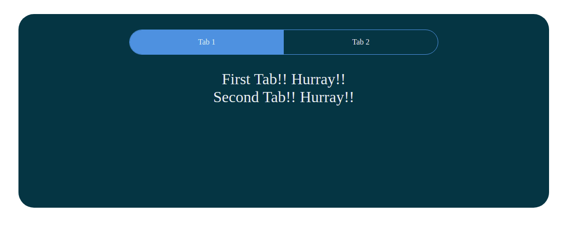
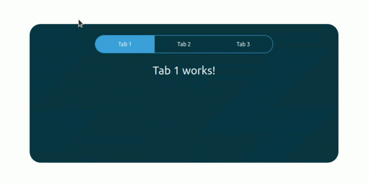
Reload the page on your browser, and you should see something similar to the image below:
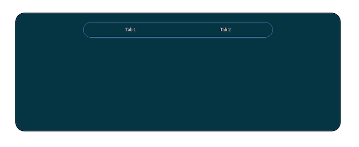
Reload the page on your browser, and you should see something similar to the following preview:
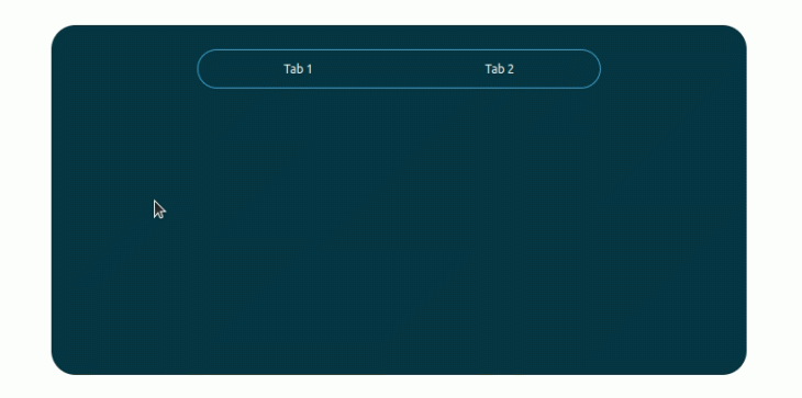
The tabs won’t switch the content yet, but they will render hover animations because of the CSS code we’ve added. Let’s add code to implement tab switching logic.
Using useState for React tab state management
When you go through the styles above, you’ll notice we have a specific style for the active tab, but how do we know which tab is active? For this, we will use the React Hook useState for managing our state. You can read more about React Hooks and state management here.
First, we need to import the useState hook from the React library and set the default active tabs from the Tabs.js file:
import React, { useState } from "react";
const Tabs = () => {
  const [activeTab, setActiveTab] = useState("tab1");
   // ... the previous codes
}
export default Tabs;
Next, we’ll check if the tab is active and add the active class to it. Otherwise, we’ll remove the active class:
// Tab nav
      <ul className="nav">
        <li className={activeTab === "tab1" ? "active" : ""}>Tab 1</li>
        <li className={activeTab === "tab2" ? "active" : ""}>Tab 2</li>
      </ul>
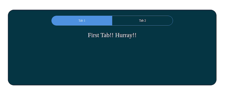
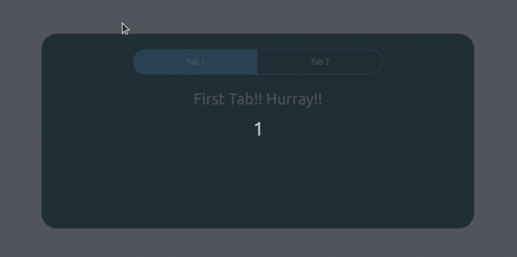
When you view it from your browser, it should look like this:
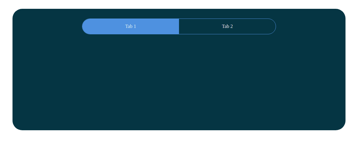
Tab 1 has a background color because it’s the active tab. Now, let’s tell the React DOM what content to show when a tab is active.
First, we need to import our first and second tab files into the tab component.
import FirstTab from "../AllTabs/FirstTab";
import SecondTab from "../AllTabs/SecondTab";
Now, add the imported components to the outlet div:
<div className="outlet">
  <FirstTab />
  <SecondTab />
</div>
When you open your browser, you’ll see a little chaos (the contents of both tabs displayed on Tab 1) but don’t worry, we’ll create order soon.
Just as we had a check on the navs to set an active class to the active nav link, we will implement the same approach to the outlet:
<div className="outlet">
  {activeTab === "tab1" ? <FirstTab /> : <SecondTab />}
</div>
What we are doing here is telling the React DOM to show the first tab only when the active tab is "tab1". Otherwise, it shows the second tab.
Creating a function to handle tab switching in React
When you click on any of the tabs, nothing happens. Let’s change that.
This function will tell the React DOM which tab content we want to render when a tab is active:
  //  Functions to handle Tab Switching
  const handleTab1 = () => {
    // update the state to tab1
    setActiveTab("tab1");
  };
  const handleTab2 = () => {
    // update the state to tab2
    setActiveTab("tab2");
  };
This is rather clean and straightforward; you could even write it on a single line, but for simplicity, let’s leave it this way.
So what is the code doing? The first function sets and updates the active tab state to "tab1" anytime it is called, and the second function does the same for "tab2".
The next step is to tag these functions to our nav links in order to be called and executed when the respective nav link is clicked:
{/* Tab nav */}
<ul className="nav">
  <li
    className={activeTab === "tab1" ? "active" : ""}
    onClick={handleTab1}
  >
    Tab 1
  </li>
  <li
    className={activeTab === "tab2" ? "active" : ""}
    onClick={handleTab2}
  >
    Tab 2
  </li>
</ul>
Look at the following complete source code of the Tabs.js component after the above modifications:
import React, { useState } from "react";
import FirstTab from "../AllTabs/FirstTab";
import SecondTab from "../AllTabs/SecondTab";
const Tabs = () => {
const [activeTab, setActiveTab] = useState("tab1");
// Functions to handle Tab Switching
const handleTab1 = () => {
// update the state to tab1
setActiveTab("tab1");
};
const handleTab2 = () => {
// update the state to tab2
setActiveTab("tab2");
};
return (
<div className="Tabs">
<ul className="nav">
<li
className={activeTab === "tab1" ? "active" : ""}
onClick={handleTab1}
>
Tab 1
</li>
<li
className={activeTab === "tab2" ? "active" : ""}
onClick={handleTab2}
>
Tab 2
</li>
</ul>
<div className="outlet">
{activeTab === "tab1" ? <FirstTab /> : <SecondTab />}
</div>
</div>
);
};
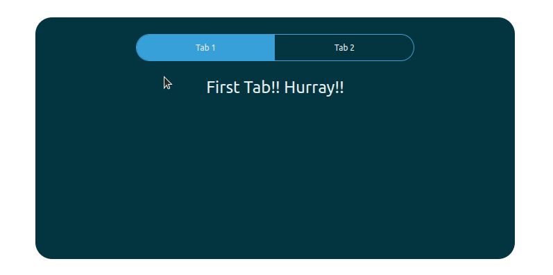
export default Tabs;That’s it! Now you can switch tabs by clicking on their respective nav link, as shown below:
Extending the code to support more tabs
What if we need to extend the code for displaying the third tab? There are two main approaches for adding another tab. We can create another component with the new tab content like we created the SecondTab component with the same code structure.
We can refactor our project to support many tab components. If we create a new component per each tab and follow the existing code structure, the source code becomes less manageable because of the repetitive code. Therefore, we can refactor the existing project to support many tabs.
We need to use the following CSS snippet to make the existing CSS code flexible for displaying more than two tabs.
ul.nav li:first-child {
  border-bottom-left-radius: 2rem;
  border-top-left-radius: 2rem;
}

ul.nav li:last-child {
  border-bottom-right-radius: 2rem;
  border-top-right-radius: 2rem;
}
The above CSS snippet styles only the first and last tab radius regardless of how many tabs we use. Replace your App.css file content with the following CSS code.
/* Remove browser defaults */
* {
  box-sizing: border-box;
  padding: 0;
  margin: 0;
}

/* Style App.js wrapper */
.App {
  width: 100vw;
  height: 100vh;
  display: flex;
  align-items: center;
  justify-content: center;
  overflow: hidden;
}

/* Tab Container */
.Tabs {
  width: 80%;
  height: auto;
  min-height: 400px;
  background: #053742;
  margin: 3.5rem auto 1.5rem;
  padding: 2rem 1rem;
  color: #E8F0F2;
  border-radius: 2rem;
  @media (max-width: 769px) {
    padding: 2rem 0;
  }

}

/* Tab Navigation */
ul.nav {
  width: 60%;
  margin: 0 auto 2rem;
  display: flex;
  align-items: center;
  justify-content: space-between;
  border: 1px solid #39A2DB;
  border-radius: 2rem;
  padding-left: 0px;
  @media (max-width: 768px) {
    width: 90%;
  }
}

ul.nav li {
  width: 50%;
  padding: 1rem;
  list-style: none;
  text-align: center;
  cursor: pointer;
  transition: all 0.7s;
}

ul.nav li:first-child {
  border-bottom-left-radius: 2rem;
  border-top-left-radius: 2rem;
}

ul.nav li:last-child {
  border-bottom-right-radius: 2rem;
  border-top-right-radius: 2rem;
}

ul.nav li:hover {
  background: rgba(50, 224, 196, 0.15);
}

ul.nav li.active {
  background: #39A2DB;
}

/* Tab Content Styles */
.TabContent {
  font-size: 2rem;
  text-align: center;
}
Now we are going to refactor our JavaScript code structure by creating two new components:
TabNavItem: a component to represent a tab navigation itemTabContent: displays content per each tab, and we can pass any content as child components
Create a directory named V2 inside the existing Components directory to store new components. Add the following code to Components/TabNavItem.js to define the TabNavItem component.
import React from "react";
const TabNavItem = ({ id, title, activeTab, setActiveTab }) => {

 const handleClick = () => {
   setActiveTab(id);
 };

return (
   <li onClick={handleClick} className={activeTab === id ? "active" : ""}>
     { title }
   </li>
 );
};
export default TabNavItem;
The above component renders a tab navigation item with an HTML li element. Here, we dynamically set the active CSS class according to the activeTab prop and the current tab identifier. Also, we use the setActiveTab callback to switch the currently selected tab.
Next, add the following code to the Components/TabContent.js file to define the TabContent component.
import React from "react";

const TabContent = ({id, activeTab, children}) => {
 return (
   activeTab === id ? <div className="TabContent">
     { children }
   </div>
   : null
 );
};

export default TabContent;
Notice we conditionally render the component based on the id and the activeTab prop. Also, we render all provided child components inside the component by using the { children } template syntax.
Now the atomic building blocks of the dynamic tab component are ready. Let’s refactor the existing Tab component source by using newly created (V2) components. Add the following code to the Components/Tabs.js file:
import React, { useState } from "react";
import TabNavItem from "../V2/TabNavItem";
import TabContent from "../V2/TabContent";

const Tabs = () => {
  const [activeTab, setActiveTab] = useState("tab1");

  return (
    <div className="Tabs">
      <ul className="nav">
        <TabNavItem title="Tab 1" id="tab1" activeTab={activeTab} setActiveTab={setActiveTab}/>
        <TabNavItem title="Tab 2" id="tab2" activeTab={activeTab} setActiveTab={setActiveTab}/>
        <TabNavItem title="Tab 3" id="tab3" activeTab={activeTab} setActiveTab={setActiveTab}/>
      </ul>

      <div className="outlet">
        <TabContent id="tab1" activeTab={activeTab}>
          <p>Tab 1 works!</p>
        </TabContent>
        <TabContent id="tab2" activeTab={activeTab}>
          <p>Tab 2 works!</p>
        </TabContent>
        <TabContent id="tab3" activeTab={activeTab}>
          <p>Tab 3 works!</p>
        </TabContent>
      </div>
    </div>
  );
};

export default Tabs;
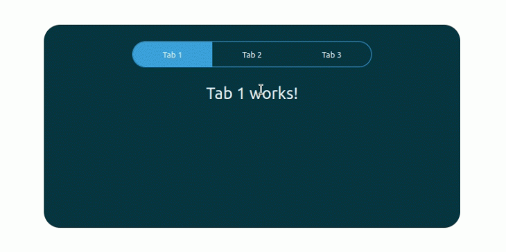
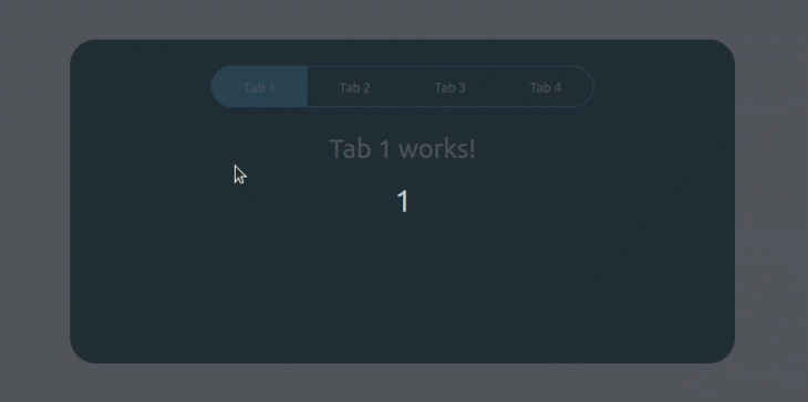
Check your browser. You will see three working tabs, as shown in the following preview.
Do you remember earlier I mentioned we are going to implement a manageable source code instead of writing repetitive code? Here’s how easy it is to add the fourth tab. Add the following line to the navigation container right after the third tab’s navigation item.
<TabNavItem title="Tab 4" id="tab4" activeTab={activeTab} setActiveTab={setActiveTab}/>Next, add tab content as follows right after the third tab’s content.
<TabContent id="tab4" activeTab={activeTab}>
 <p>tab4 works!</p>
</TabContent>
See the fourth tab in the browser.
Also, you can reuse the previous FirstTab and SecondTab components, too. For example, look at the following code:
import React, { useState } from "react";
import FirstTab from "../AllTabs/FirstTab.js";
import SecondTab from "../AllTabs/SecondTab.js";
import TabNavItem from "../V2/TabNavItem";
import TabContent from "../V2/TabContent";

const Tabs = () => {
  const [activeTab, setActiveTab] = useState("tab1");

  return (
    <div className="Tabs">
      <ul className="nav">
        <TabNavItem title="Tab 1" id="tab1" activeTab={activeTab} setActiveTab={setActiveTab}/>
        <TabNavItem title="Tab 2" id="tab2" activeTab={activeTab} setActiveTab={setActiveTab}/>
      </ul>

      <div className="outlet">
        <TabContent id="tab1" activeTab={activeTab}>
          <FirstTab/>
        </TabContent>
        <TabContent id="tab2" activeTab={activeTab}>
          <SecondTab/>
        </TabContent>
      </div>
    </div>
  );
};

export default Tabs;
The above code will show the content from FirstTab and SecondTab components.
Creating tabs with the react-tabs library
At this stage, you already know how to create React tab components from scratch without a third-party library. But, we had to write code to display and set the currently selected tab by managing the tab component state.
Implementing tab components from scratch gives us full flexibility and freedom, but it can be a time-consuming task for building modern rapid application development culture.
Therefore, you can use a fully featured library to create tab components in your React applications. The react-tabs library is a popular library to create tab components.
Now, we are going to re-create the previous application by using the react-tabs library. First, install the react-tabs library with npm install react-tabs. Next, add the following content to App.js.
import { Tab, Tabs, TabList, TabPanel } from "react-tabs";
import "./App.css";

function App() {
 return (
   <div className="App">
     <Tabs className="Tabs">
       <TabList>
         <Tab>Tab 1</Tab>
         <Tab>Tab 2</Tab>
         <Tab>Tab 3</Tab>
       </TabList>
<TabPanel>
         <p>Tab 1 works!</p>
       </TabPanel>
       <TabPanel>
         <p>Tab 2 works!</p>
       </TabPanel>
       <TabPanel>
         <p>Tab 3 works!</p>
       </TabPanel>
     </Tabs>
   </div>
 );
}

export default App;
Note that here we are importing some pre-built components from the react-tabs library to get our tab component working. The library will auto-generate tab identifiers, so we don’t need to use an id like prop.
If you check the browser now, you will notice that tabs are missing CSS styles. This is because the current App.css CSS classes don’t map with the library’s internal CSS classes properly. Therefore, update the App.css file by adding:
/* Remove browser defaults */
* {
  box-sizing: border-box;
  padding: 0;
  margin: 0;
}

/* Style App.js wrapper */
.App {
  width: 100vw;
  height: 100vh;
  display: flex;
  align-items: center;
  justify-content: center;
  overflow: hidden;
}

/* Tab Container */
.Tabs {
  width: 80%;
  height: auto;
  min-height: 400px;
  background: #053742;
  margin: 3.5rem auto 1.5rem;
  padding: 2rem 1rem;
  color: #E8F0F2;
  border-radius: 2rem;
}

.react-tabs {
  -webkit-tap-highlight-color: transparent;
}

.react-tabs__tab-list {
  width: 60%;
  margin: 0 auto 2rem;
  display: flex;
  align-items: center;
  justify-content: space-between;
  border: 1px solid #39A2DB;
  border-radius: 2rem;
  padding-left: 0px;
}

.react-tabs__tab {
  width: 50%;
  padding: 1rem;
  list-style: none;
  text-align: center;
  cursor: pointer;
  transition: all 0.7s;
}

.react-tabs__tab--selected {
  background: #39A2DB;
}

.react-tabs__tab--disabled {
  color: GrayText;
  cursor: default;
}

.react-tabs__tab:hover {
  background: rgba(50, 224, 196, 0.15);
}

.react-tabs__tab:first-child {
  border-bottom-left-radius: 2rem;
  border-top-left-radius: 2rem;
}

.react-tabs__tab:last-child {
  border-bottom-right-radius: 2rem;
  border-top-right-radius: 2rem;
}

.react-tabs__tab-panel {
  display: none;
}

.react-tabs__tab-panel--selected {
  display: block;
  font-size: 2rem;
  text-align: center;
}
Conclusion
Great job for getting this far! In this guide, we build a React tab component, used React Hooks to manage our active tab state, and created simple functions to control and handle tab switching. Also, we refactored the tab component codebase to support many tabs and used the react-tabs library to speed up the React tab component development.