
 открыть бот

How to use Ant Design with Next.js

Ant Design is an enterprise UI design library for React applications. It consists of many components and was developed to help speed up our dev cycles. Ant Design is an open-source package for React; it is officially supported and remains one of the most popular UI kits today.
Next.js is a popular ReactJS framework, known for its performance, developer experience, and out-the-box pre-built configuration. No manual configuration is necessary for this.
By combining Next.js with Ant Design, we can build scalable, efficient, and developer-friendly apps with ease. In this article, we will be taking a look at how developers can integrate Ant Design with Next.js — let’s get started!
Here’s what we will be doing today:
Creating a NextJS app
First, let’s create a Next.js app using the following command:
There is also a TypeScript version, but here I’m using the JavaScript version.
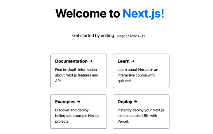
After installation, enter the below command and go to localhost:3000 in your browser to see the app.
cd app-name
yarn run dev
You can see the homepage in the browser:
Next, let’s install Ant Design to make our app more interactive.
Install Ant Design
We can install Ant Design to your Next.js app with a single command:
yarn add antd
After installation, we can start configuring Ant Design in the Next.js app.
Import antd/dist/antd.css in the _app.js file. By doing this, we import the Ant Design component styles globally and are not required to import each component individually. Ant Design also supports the Less version of CSS.
Adding Ant Design components
Now, let’s start adding in the components that make up the Ant Design system.
Layouts
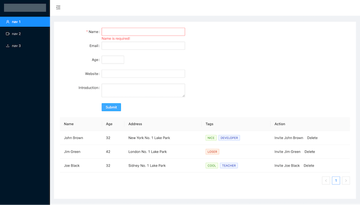
Remove the existing code from index.js and add the below code to include the top bar and sidebar with menus.
//.jsx
import {
  MenuFoldOutlined,
  MenuUnfoldOutlined,
  UploadOutlined,
  UserOutlined,
  VideoCameraOutlined,
} from '@ant-design/icons';
import { Layout, Menu } from 'antd';
import React, { useState } from 'react';
const { Header, Sider, Content } = Layout;

export default function Home() {
  const [collapsed, setCollapsed] = useState(false);
  return (
      <Layout className="layout">
        <Sider trigger={null} collapsible collapsed={collapsed}>
          <div className="logo" />
          <Menu
              theme="dark"
              mode="inline"
              defaultSelectedKeys={['1']}
              items={[
                {
                  key: '1',
                  icon: <UserOutlined />,
                  label: 'nav 1',
                },
                {
                  key: '2',
                  icon: <VideoCameraOutlined />,
                  label: 'nav 2',
                },
                {
                  key: '3',
                  icon: <UploadOutlined />,
                  label: 'nav 3',
                },
              ]}
          />
        </Sider>
        <Layout className="site-layout">
          <Header
              className="site-layout-background"
              style={{
                padding: 0,
              }}
          >
            {React.createElement(collapsed ? MenuUnfoldOutlined : MenuFoldOutlined, {
              className: 'trigger',
              onClick: () => setCollapsed(!collapsed),
            })}
          </Header>
          <Content
              className="site-layout-background"
              style={{
                margin: '24px 16px',
                padding: 24,
              }}
          >
            Content
          </Content>
        </Layout>
      </Layout>
  )
}
In the above code, we have included the Ant layout component with the sidebar. Add the below CSS in the globals.css file to make some UI improvements.
//.css
.trigger {
  padding: 0 24px;
  font-size: 18px;
  line-height: 64px;
  cursor: pointer;
  transition: color 0.3s;
}

 .trigger:hover {
  color: #1890ff;
}

 .logo {
  height: 32px;
  margin: 16px;
  background: rgba(255, 255, 255, 0.3);
}

.site-layout .site-layout-background {
  background: #fff;
}

.layout {
  height: 100vh;
}
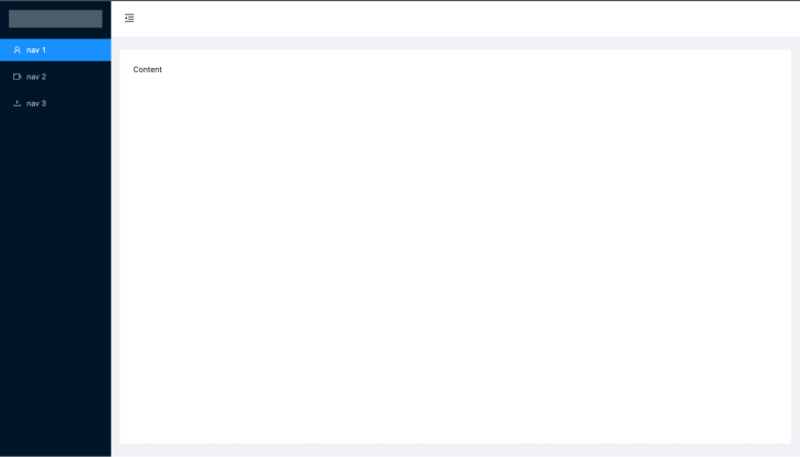
Once you add the above CSS, navigate to your browser and you can see the output. As you can see, we completed the layout with menus in just a few minutes, which is pretty good!
Next, we can add form components to get user data. You are not required to install a third-party form package for this, as Ant itself already includes form components with some powerful features.
Forms
Ant design form comes with pre-defined validation rules, default value options, and various inputs. Create a customForm component in the components folder and add the following code:
//.jsx
import React from 'react';
import { Button, Form, Input, InputNumber } from 'antd';
const layout = {
    labelCol: {
        span: 8,
    },
    wrapperCol: {
        span: 16,
    },
};
/* eslint-disable no-template-curly-in-string */

const validateMessages = {
    required: '${label} is required!',
    types: {
        email: '${label} is not a valid email!',
        number: '${label} is not a valid number!',
    },
    number: {
        range: '${label} must be between ${min} and ${max}',
    },
};
/* eslint-enable no-template-curly-in-string */

const CustomForm = () => {
    const onFinish = (values) => {
        console.log(values);
    };

    return (
        <Form className="form" {...layout} name="nest-messages" onFinish={onFinish} validateMessages={validateMessages}>
            <Form.Item
                name={['user', 'name']}
                label="Name"
                rules={[
                    {
                        required: true,
                    },
                ]}
            >
                <Input />
            </Form.Item>
            <Form.Item
                name={['user', 'email']}
                label="Email"
                rules={[
                    {
                        type: 'email',
                    },
                ]}
            >
                <Input />
            </Form.Item>
            <Form.Item
                name={['user', 'age']}
                label="Age"
                rules={[
                    {
                        type: 'number',
                        min: 0,
                        max: 99,
                    },
                ]}
            >
                <InputNumber />
            </Form.Item>
            <Form.Item name={['user', 'website']} label="Website">
                <Input />
            </Form.Item>
            <Form.Item name={['user', 'introduction']} label="Introduction">
                <Input.TextArea />
            </Form.Item>
            <Form.Item wrapperCol={{ ...layout.wrapperCol, offset: 8 }}>
                <Button type="primary" htmlType="submit">
                    Submit
                </Button>
            </Form.Item>
        </Form>
    );
};

export default CustomForm;
Include the CustomForm component in index.js as below to make it visible on the homepage.
//.jsx
         <Content
              className="site-layout-background"
              style={{
                margin: '24px 16px',
                padding: 24,
              }}
          >
            <CustomForm/>
          </Content>
Validation
Ant forms include the rule props to add validation for each input with less work. In the above form, we have validated the email input using the email type rule.
//.jsx
rules={[
                    {
                        type: 'email',
                    },
                ]}
Commonly used validation rules
- Enum: Match enum value
- Len: Number or string length
- Max: Maximum length of string and number
- Min: Minimum length of string and number
- Pattern: RegEx pattern
- Whitespace: Validates if the input has whitespace
- Type: Validates string, number, email, boolean, and URL
API integration
We can use the onFinish function to submit the form data to the backend using APIs after validating.
//.jsx
 const onFinish = (values) => {
       fetch('https://example.com/profile', {
    method: 'POST', // or 'PUT'
  headers: {
    'Content-Type': 'application/json',
  },
  body: JSON.stringify(values),
})
  .then((response) => response.json())
  .then((data) => {
    console.log('Success:', data);
  })
  .catch((error) => {
    console.error('Error:', error);
  });
};
Pre-fill data to form fields
We can use setFieldsValue to set values in the form:
form.setFieldsValue({ name: 'Jack' });

form.setFieldsValue({ email: '[email protected]' });
Navigate to the browser to see our form in action:
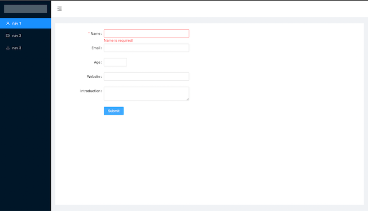
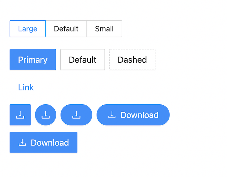
In the above UI, we have used the primary button component; Ant Design also includes other types of buttons, like these below:
Tables
Next, let’s include a table in our app to list some data.
Add the below code and add it to the components/CustomTable.js component.
//.jsx
import { Space, Table, Tag } from 'antd';
import React from 'react';

const columns = [
  {
    title: 'Name',
    dataIndex: 'name',
    key: 'name',
    render: (text) => {text},
  },
  {
    title: 'Age',
    dataIndex: 'age',
    key: 'age',
  },
  {
    title: 'Address',
    dataIndex: 'address',
    key: 'address',
  },
  {
    title: 'Tags',
    key: 'tags',
    dataIndex: 'tags',
    render: (_, { tags }) => (
      <>
        {tags.map((tag) => {
          let color = tag.length > 5 ? 'geekblue' : 'green';

          if (tag === 'loser') {
            color = 'volcano';
          }

          return (

              {tag.toUpperCase()}

          );
        })}
      </>
    ),
  },
  {
    title: 'Action',
    key: 'action',
    render: (_, record) => (

        Invite {record.name}
        Delete

    ),
  },
];

const data = [
  {
    key: '1',
    name: 'John Brown',
    age: 32,
    address: 'New York No. 1 Lake Park',
    tags: ['nice', 'developer'],
  },
  {
    key: '2',
    name: 'Jim Green',
    age: 42,
    address: 'London No. 1 Lake Park',
    tags: ['loser'],
  },
  {
    key: '3',
    name: 'Joe Black',
    age: 32,
    address: 'Sidney No. 1 Lake Park',
    tags: ['cool', 'teacher'],
  },
];

const CustomTable = ()
; export default CustomTable;
The table component has two major props; columns and dataSource.
The columns prop is used to pass the table columns and dataSource is used to pass the data for the table.
Next, import the table component in the index.js file. Now, the table is included on our homepage as below:
Commonly used table props
- Pagination: To add pagination for the table
- Loading: To show loading on API calls
- Columns: Columns of the table
- dataSource: Data for the table
- Size: Table size
Commonly used columns props
- defaultSorter: Default order of the sorted values
- render: Render the table cells
- sorter: Sorter function for table columns
- align: Column alignment
Ant Design’s table component includes frontend and backend pagination, sorting, filters, checkboxes for selecting rows, nested sets, infinite scroll tables, and more.
ConfigProvider
ConfigProvider is the context API for Ant Design components to configure the properties globally. You can add ConfigProvider by inserting the following:
//.jsx
import { ConfigProvider } from 'antd';

export default () => (


);
Configure locale
You can simply set local all components using the config provider below.
//.jsx
import { ConfigProvider } from 'antd';

export default () => (
  <ConfigProvider direction="rtl" locale="en">
    <App />
  </ConfigProvider>
);
Component size config
//.jsx
import { ConfigProvider } from 'antd';

export default () => (
  <ConfigProvider direction="rtl" locale="en" componentSize="medium">
    <App />
  </ConfigProvider>
);
We can use configProvide for subtree components, not only as global components.
Icons
To use Ant Design icons we need to install the icons package from Ant using this command:
yarn add @ant-design/icons
Ant has three different icon types:
- Outlined
- Filled
- Two-tone
Import in the components as below:
//.jsx
import {
    HomeOutlined,
    LoadingOutlined,
    SettingFilled,
    SyncOutlined

} from '@ant-design/icons';

const  iconSize = { fontSize: '40px', color: '#08c' };

const ShowIcons = () => (
<HomeOutlined  style={iconSize} />
<SettingFilled  style={iconSize} />
<SyncOutlined spin  style={iconSize} />
<LoadingOutlined  style={iconSize} />
);
Icons output
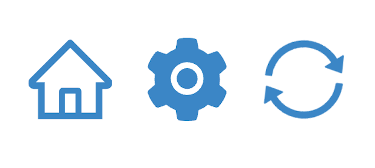
Ant Design has components for List, Alerts, Notification, Pickers, Icons and more — you can explore all the components by following this link.
Issues and optimization
The major issue we would face is the CSS bundle size, as we imported the entire CSS file in _app.js as below in _app.js, which would import the CSS for all the Ant Design components, irrespective of their usage.
import ‘antd/dist/antd.css
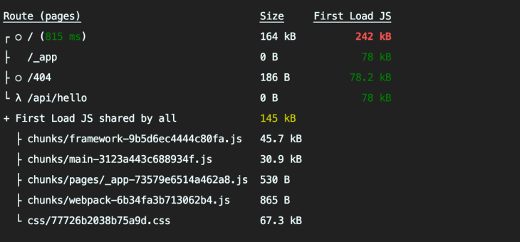
When we build the app, we might see the CSS size. The total CSS size for our example app is 67.3KB. Check the image below for more information.
(Note: Command to build: yarn build)
This seems very large, and it will decrease the app performance and increase the app loading time. To fix this, we can reduce it by importing the CSS only for the used components.
Component-level CSS import
Using the next-plugin-antd-less and babel-plugin-import packages and adding some config, we can achieve this.
Use the following commands to install the packages:
yarn add next-plugin-antd-less
yarn add --dev babel-plugin-import
After installation, create .babelrc file in the root folder and add the below code.
.json
{
  "presets": ["next/babel"],
  "plugins": [
    [
      "import",
    {
      "libraryName": "antd",
      "style": true
    }
  ]]
}
Next, add the below config code in the next.config.js file.
//.js

const withAntdLess = require('next-plugin-antd-less');

module.exports = withAntdLess({
  // modifyVars: { '@primary-color': '#04f' }, // optional
  lessVarsFilePath: './src/styles/variables.less', // optional
  lessVarsFilePathAppendToEndOfContent: false, // optional
  // optional https://github.com/webpack-contrib/css-loader#object
  cssLoaderOptions: {
    // ...
    mode: "local",
    localIdentName: "[hash:base64:8]",but you can rewritten getLocalIdentFn
    exportLocalsConvention: "camelCase",
    exportOnlyLocals: false,
    // ...
    getLocalIdent: (context, localIdentName, localName, options) => {
      return "whatever_random_class_name";
    },
  },

  // Other Config Here...

  webpack(config) {
    return config;
  },
});
Remove the imported antd.css file from _app.js.
import 'antd/dist/antd.css
Now build the example app:
yarn build
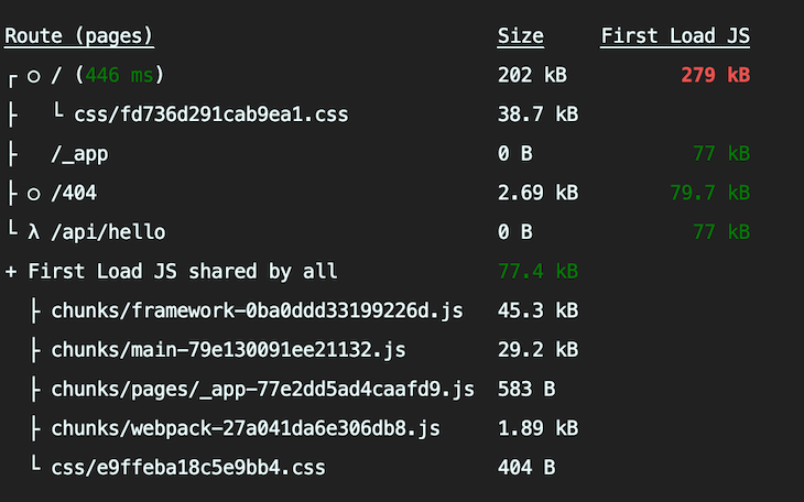
Once the build is completed, we can see the CSS bundle size has been reduced from 67.3KB to 38.7KB. We have reduced the size by around 40% by doing this!
Conclusion
Ant Design helps to build a rich user interface with minimal work and less time than traditional means. It can be used for all types of apps and its community is large and engaged in case you need to get help. In this article, we have covered the essential components; visit the Ant Design docs to explore all the components and see how you can use Ant Design to improve your project development.